Visualizing large hierarchical data
 Dr. Guillaume Fontorbe
What is hierarchical data?
Hierarchical data is a type of data organized in a tree-like structure consisting of nodes connected by a “parent-child” relationship. Each node can have zero or more children, and each node has exactly one parent (except for the root node, which has no parent). This structure is very common in computer science and is used in many applications, such as file systems, XML documents, or even the DOM of a web page.
This type of data is fairly easy to represent even just as a mental exercise, because there is only one type of relationship between the nodes: the parent-child relationship.

But what if we want to represent more complex data? What if we want to represent a tree-like structure that has more than one type of relationship between the nodes? This is where things can get messy very quickly.
Nesting nodes
Let’s say we have a dataset with two types of relationships between nodes, the parent-child relationship, and a second relationship that has nothing to do with hierarchical information. One such example could be representing a TypeScript project structure and dependency graph. In this case, we would have a parent-child relationship between the folders and files, and a dependency relationship between the files representing imports from one file to another. The dependency graph in itself can be a complex structure with edges crossing the hierarchy levels, cycles, and so on. As we will soon see, trying to represent several unrelated relationship in a similar fashion can lead to a very confusing diagram.
We will use a package from the Eclipse Theia repository to illustrate this. This package is a subset of the entire project but is large enough for our example.
Let’s first have a look at what the folder structure looks like if we were to represent it as a tree-like structure:
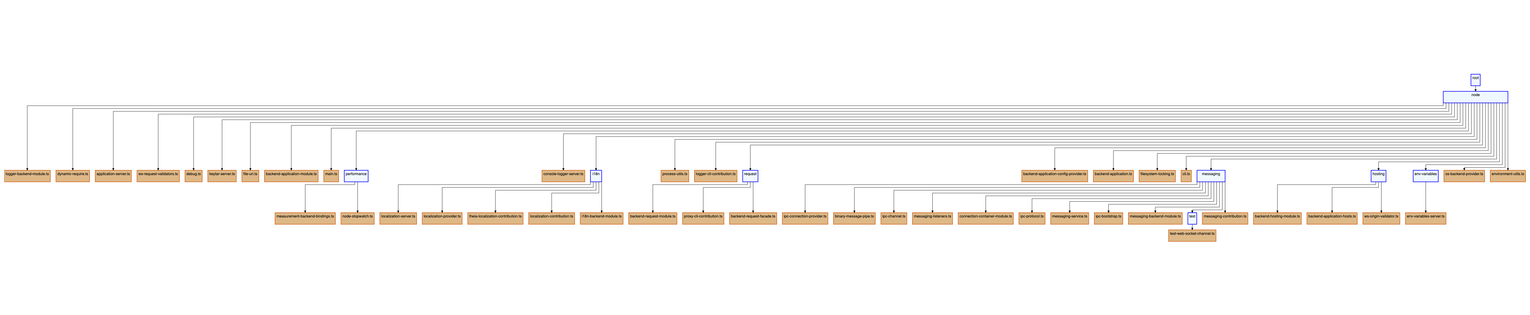
The data is hard to read on this image (more about that later), but the hierarchy is clear. Now, let’s add the file dependencies to the mix:
We now have two types of edges that are controlling the flow of our diagram, and because our layout algorithm cannot distinguish between these two types of edges, we have lost the clear hierarchical information we had before. This is where nesting nodes comes in handy.
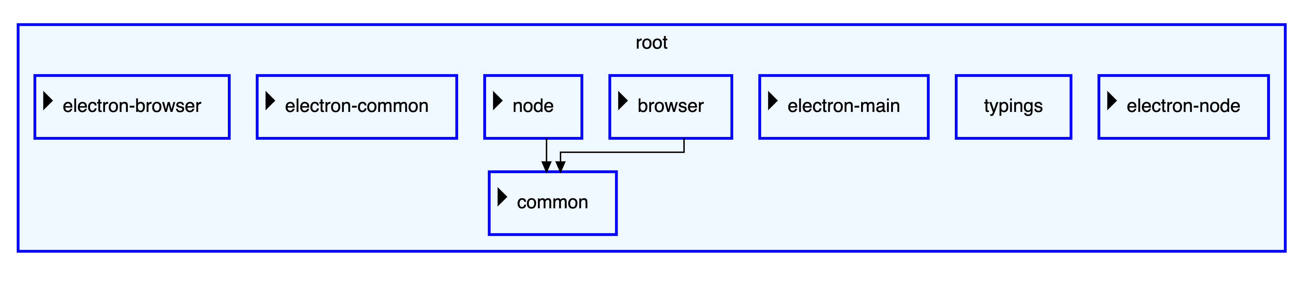
What if, instead of representing our parent-child relationship as edges, we represented it as nested nodes? This would give us a clear separation between the two types of relationships, and make the diagram easier to understand. This is what is done in file explorers, you see the files and folders that are inside the current folder, and you can expand the “children folders” to see what is inside them.
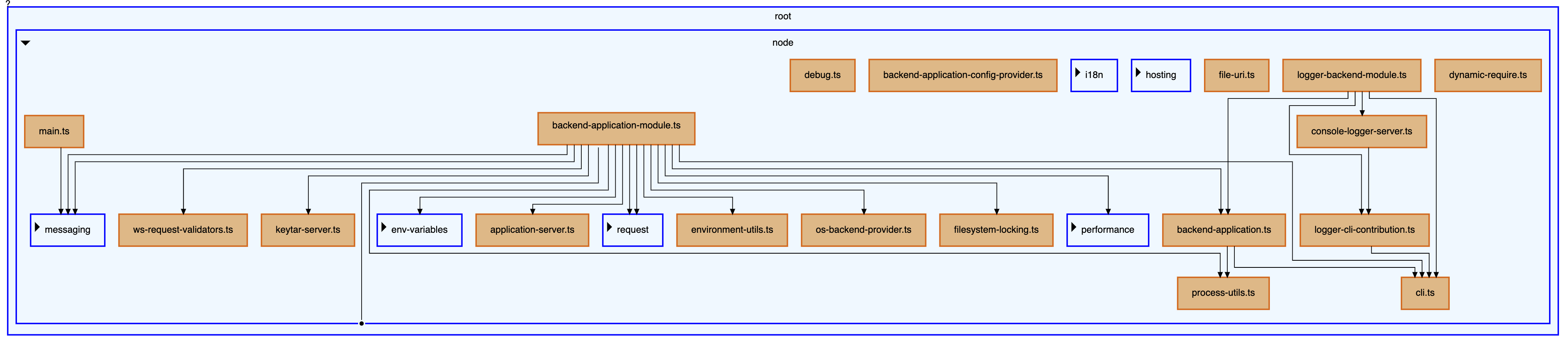
This is much better, now the hierarchical information is represented by nodes that can be expanded or collapsed when the user clicks on them. We introduced some kind of containment to show the parent-child relationship and the focus is now on the dependencies between the files.
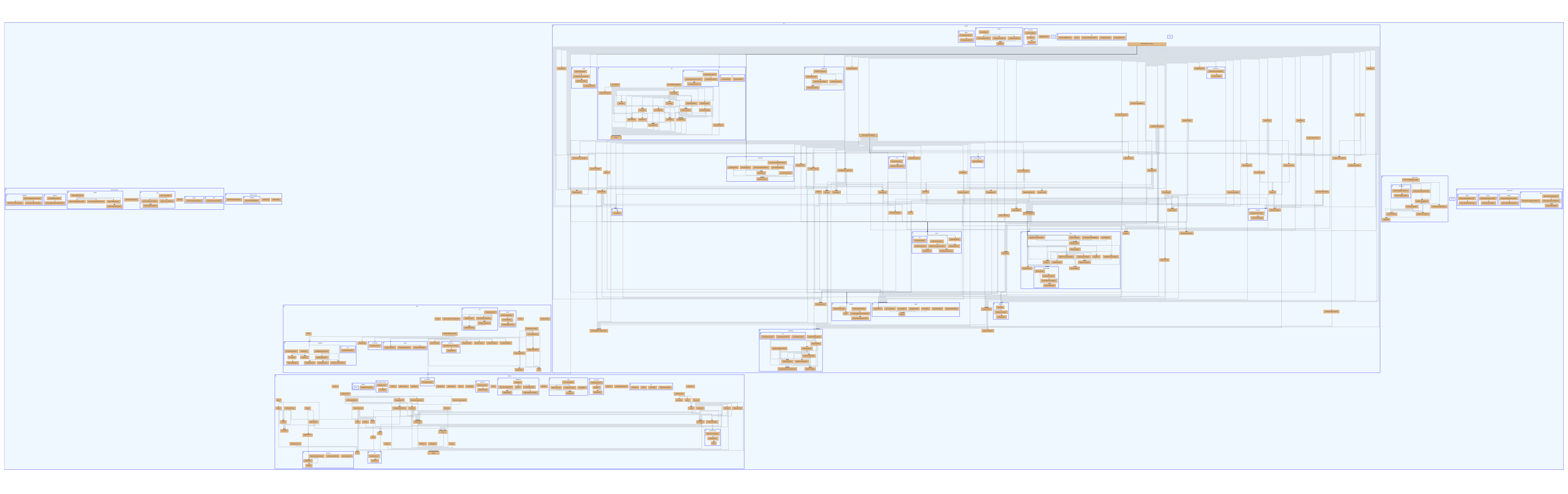
But we still have a problem: so far we have only looked at a subset of the data and the real diagram is too large to display on a single screen and show valuable information. We need to find a way to display only the relevant information, or at least help the user navigate through the information presented.
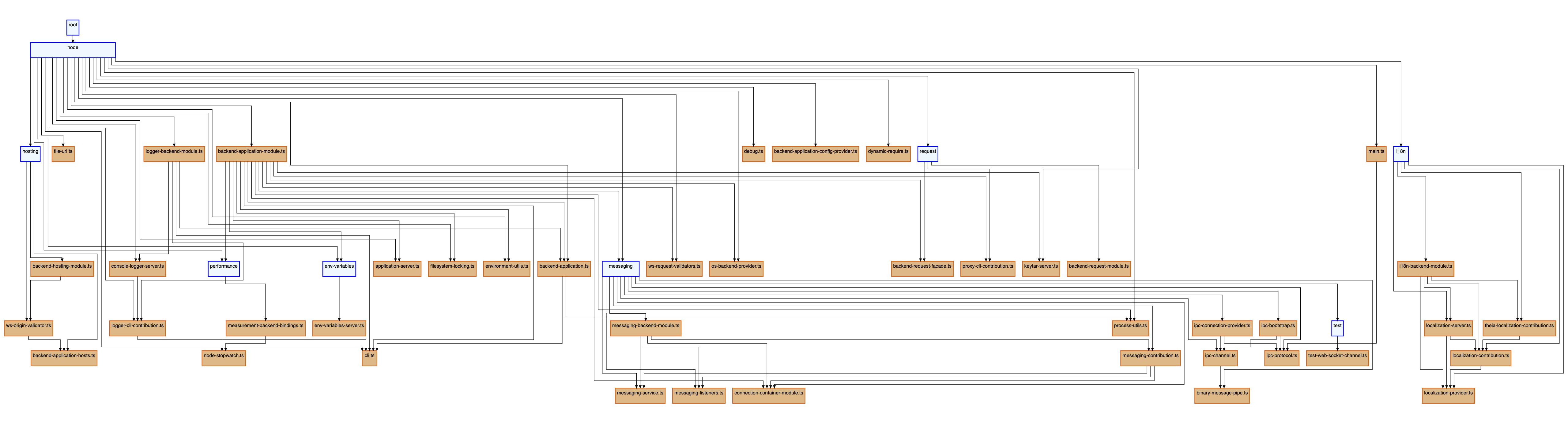
This is what the complete dataset would look like:
Avoiding information overload
If your first impression when looking at your diagram is “what am I looking at?” or “where do I start?” then you need to rethink your diagram. Again, the goal of a diagram is to convey information in a way that is easy to understand and use. If the diagram is too complex, it will be difficult to understand and use, and therefore will not be useful.
The simpler the better, and lots of information can be too much information. You need to find a way to show only the relevant information and hide the rest. Let’s go back to our “file explorer” analogy. If you were to open your file explorer and see your entire file system at once, you would probably be overwhelmed by the amount of information presented. This is why file explorers only show the contents of the current folder, and allow you to expand the “child” folders to see what is inside them.
We can take the same approach here and collapse all our nodes by default. This way we see only the root node and its direct children. We can then expand the nodes we are interested in to see their children, and so on. Requiring an action to navigate through the diagram makes it easier to understand the context of the data being presented.
This is much better, and it’s just the beginning. We could go further and add a search bar to allow the user to search for a specific node, add smart filters that depend on our business model, etc. This will be the focus of a future blog post, so stay tuned!
Another thing to consider is styling. You may have different types of edges that have different meanings. Styling them differently can help the user understand the diagram more easily. You could also use different colors for the nodes to represent different types of nodes (in our example folders and files have different styling to quickly identify them).
To go further
Let’s have a very brief look at performance. If you’re dealing with a large dataset, you’ll probably need to optimize data retrieval so that you don’t have to load the entire dataset at once. Nesting nodes can solve this problem by allowing a kind of “lazy loading” of the data. You could load only the root node and its immediate children, and then load the children of the expanded nodes as the user expands them. This way, you load only the data you need, and you can even unload the data that is no longer needed (for example, when the user collapses a node).
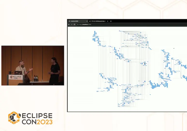
Let’s stop there for now, if you want to dive deeper into this topic, please listen to this EclipseCon talk by Jan and Miro.
The examples used in this article were created using Sprotty as a framework and are available on our Github repo.
About the Author
Dr. Guillaume Fontorbe
Avid learner, Guillaume is always looking for new challenges to take on. At TypeFox, he focuses on building visualization tools, DSLs, and IDE extensions. In addition, he also actively takes part in the development of various TypeFox’s open source projects.
Read more about this topic

Oct 18th 2023
Jan Bicker, Dr. Miro Spönemann
High-performance graphical view filtering with Sprotty
Jan and Miro present three techniques for managing large models: reducing rendering load, dynamic model filtering, and hierarchical nesting.
watch the video
Nov 4th 2022
Dr. Miro Spönemann
Textual and graphical languages for the cloud era
TypeScript has become the standard for cloud-based developer tools; the blog proposes Langium to create a cohesive technology stack combining text and graphics.
read the article
Oct 25th 2022
Dr. Miro Spönemann
Textual and graphical languages for the cloud era
Miro explores cloud-based DSLs and introduces Langium and its integration with Sprotty for graphical views driven by textual languages.
watch the video